Impressive Architectural Design of Spanish Wineries
In the last two decades, contemporary architecture has staged a thrilling encounter with the unlikely world of viticulture. Originating in California’s Napa Valley, the earliest of these winery designs were brash and postmodern, selfstyled “temples to wine” that created a thriving tourist market around California’s vineyards. But in recent years, innovation has turned West, flourishing as a modern form of branding amongst the ancient Spanish wineries of northern Spain.
Branding, of course, is tightly bound up with contemporary architecture. Retail shops, fashion houses, hotels and restaurants seek out an identity in architecture: signature styles, celebrity names and the thrill of the avant-garde leave their trace on the brand, infusing them with the cutting-edge aura of a building that pushes boundaries. Increasingly, architectural branding is designed to entice customers out of their own worlds into a fairyland of high-end luxury and breathtakingly improbable design.
But wineries – particularly European wineries – are different. These brands don’t float free, placeless products in a global economy. Vineyards trade on their terroir, the flavour of the land and geography and climate. The land shapes the wine in these areas, and, despite even the most sweeping architectural gesture, the prestige of the winery comes first and foremost from the vineyards, the appellations and the grapes themselves. As such, the buildings can’t lift the brand entirely out of their environment without compromising the integrity of the product. And yet the environment is hardly the stuff of avant-garde architecture. Areas like northern Spain are defined by their centuries-old vineyards and rustic peasant buildings: plenty of stone but very little that defies gravity or violates tradition.
Frank Gehry, of course, is famous for his gleeful disregard of gravity and tradition alike. His highly anticipated design for Spanish winery, Marqués de Riscal, doesn’t disappoint – but nor does it totally abandon the local. Instead, the building literalises the winery’s own claim to unify tradition and the avant-garde.
Located in Elciego, a sleepy medieval village in the Rioja wine district, Gehry’s trademark waves of undulating titanium erupt out of the landscape. The building is widely taken as a follow-up to the groundbreaking Guggenheim Bilbao, a masterstroke of branding (both of the Guggenheim and of Gehry himself) that is located only an hour and a half north of the Spanish winery. Certainly, despite their highly symbolic colouring (purple for wine, silver for the bottle’s capsule and gold for the mesh that wraps the bottles), the trademark sheets of undulating titanium recall nothing if not Gehry’s own works. But unlike these earlier designs, the titanium ribbons of the Spanish winery, Marqués de Riscal aren’t structural; instead, the building is grounded by a series of rectilinear shapes in local sandstone. The same colour and material as both the earth and the impressive church that forms the village’s other great landmark, this gesture manages, against all the odds, to engage Gehry’s eccentric structure in a dialogue with its surrounds.
Just down the road in Haro (where Zaha Hadid has erected her own monument to viticulture at the R. López de Heredia winery), locals celebrate wine culture with an annual Batalla del Vino, a literal wine fight that drenches its participants and the landscape in bucketfuls of cheap wine. Gehry’s structure seems to reference this bacchanalian spirit: wine as indulgence and abandon, a joyful revelry in the richness of life. Indeed, it’s a building whose function is the winery’s froth: a hotel, spa and restaurant, Gehry’s building sells wine but doesn’t produce it. In this sense, it’s pure brand, the beautiful, spectacular public face that references, reflects and magnifies the winery’s impressive wine cellars and wine-production facilities.
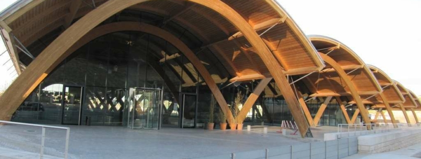
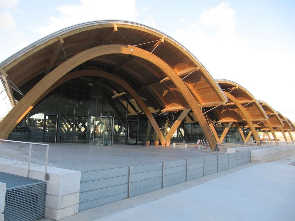
In the Ribera del Duero, a neighbouring winemaking district, Richard Rogers (with Alonso Balaguer y Arquitectos Asociados) and Norman Foster are responding to the rather different challenge of designing wineries that integrate promotion with production. If Gehry’s design tips the balance heavily in favour of branding, Rogers and Foster both defer to the primacy of the landscape and of the winery’s functions. Rogers’ design for the Spanish Winery, Protos, in Peñafiel sits on a triangular site whose overwhelming mass is broken into a series of five parabolic vaults, supported by laminated timber arches and clad in terracotta tiles. Its underground cellars connect to an existing network of tunnels, traditionally used by the bodega for wine production and storage. Partially underground, the site uses thermal mass for passive cooling, a modern and environmentally sound quotation of traditional winemaking practice. Where Gehry’s design answers the local church as an equal, Rogers’ defers to Peñafiel’s medieval castle, perched on a hill directly above the winery. From the castle, Rogers’ structure appears as a series of modern shapes in traditional materials. The tiles repeat the terracotta roofs of neighbouring buildings to affirm the winery’s position within the community, while its clean curves establish its own distinct identity.
Foster’s Faustino Winery in Gumiel de Izan performs a similar feat of traditionalised modernity. With a palette of steel, glass and oak, the symbolism of Foster’s building references the processes of production instead of the joys of consumption. Its sleek, low-lying stature cleaves to the ground rather than launching into a dreamworld. The trefoil design aestheticises the functional, visually demarcating the three processes of production: fermentation, ageing in bottles and ageing in barrels. Partially submerged to maximise thermal mass and maintain an optimal temperature, the two arms of the ageing process are connected by a road that passes over their roofs. The subdued undulations of the road mimic the rise and fall of the land, as the building sinks symbolically into the earth. Like Rogers’ Bodega Protos, the innovative shapes modernise traditional design processes and universalise the virtues of the terroir.
Rogers’ and Foster’s sober, functional designs seem to be the precise opposite of Gehry’s celebratory architecture. Contemporaneous with each other and virtually neighbours, these two tendencies nonetheless represent the poles of architecture’s engagement with winery design. And yet, oscillate as they will between these extremes, the animating dynamic in each building is always the tension between authenticity and extravagance, between the local and the global, between tradition and terroir. This basic opposition, intrinsic to the very act of engaging a world-class architect for a local Spanish Winery is itself productive. Calling on globalised architects to engage with the local, and local communities to welcome the avant-garde, these Spanish wineries are exemplary buildings in the age of the celebrity architect.
With thanks to www.specifier.com for this excellent and interesting article.
Many of these wineries (and more) included in this article are/can be included in the itineraries of our Customized Wine Tours where you can enjoy private wine tastings and guided tours of exclusive Spanish wineries, experiencing both the groundbreaking architecture as well as the wine!

